Netflix upgrades TV app interface
VOD News | On 19, Jul 2018
Netflix is rolling out a new interface for its TV app.
The new interface, which is rolling out worldwide this week, was based on rigorous research and testing around how the company can make it easier to find titles on TVs, where navigation can feel a bit tougher when viewers are restricted to just a few buttons on a remote control.
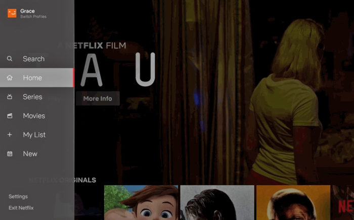
The new TV interface introduces a handy navigation panel on the left hand side of the screen. It makes it easier to search and view new content added to the service, as well as access titles users have saved for later viewing in My List. Perhaps most notable of all, though, is that it is now easier to start browsing with either a series or movie.
“At Netflix, we are constantly asking ourselves what can we do to make it even easier for our members to spend less time browsing and more time discovering stories they will love. We realise that there so many great stories on the service, and that sometimes our members need a little bit of help figuring out where to start,” says Stephen Garcia, Director, Product Innovation.
“Our research has shown us that while a member generally isn’t sure what exact title they want to watch, they have a pretty good sense of whether they are in the mood for a quick series episode or a longer movie experience.”
“While this may feel like an obvious update to some, validating that this TV experience was better for our members took extensive research, testing and technology improvements,” he adds. “Along those lines, we will continuously learn from our members and evolve the TV experience so that it gets even more simple, fun and easy to find the stories that make Netflix great.”
The update follows a similar switch in user interfaces across Netflix, which saw the introduction of video previews instead of static thumbnail images to engage users browsing the platform. Other planned improvements will also be rolled out over the coming months.
Tags
Netflix
Related Posts
Trailer: Netflix to release The Boy Who Harnessed the Wind in UK cinemas... January 25, 2019 | VOD News

Leslye Headland to write and direct Netflix’s Tell Me Everything... October 11, 2018 | VOD News
Déborah François and Mario Casas star in Netflix’s The Paramedic... October 22, 2019 | VOD News

The Netflix effect: Sales of DVDs have more than halved in UK... March 2, 2016 | VOD News