How the Daredevil opening title sequence was made: An interview with director Patrick Clair
David Farnor | On 10, May 2015
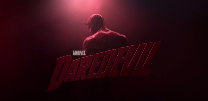
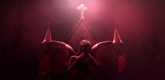
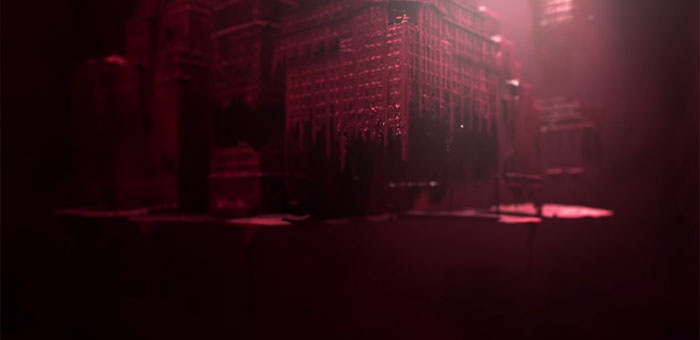
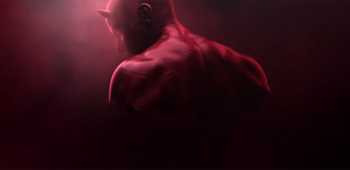
A month ago today, Marvel’s Daredevil premiered on Netflix (you can read our binge reviews here). The first in a string of new superhero series made with the streaming site, the show is dark, violent and unlike anything in Marvel’s screen universe so far. A big part of setting that tone is its opening credits, a striking, red title sequence that sees Hell’s Kitchen, New York, covered in what appears to be blood.
The sequence was produced by filmmaking collective Elastic and directed by Patrick Clair, creative head of Antibody. If you haven’t heard of Elastic, you’ve certainly seen their work: over the years, they’ve created some of TV’s most memorable opening credits, from Game of Thrones to True Detective.
We speak to Patrick Clair about how the Daredevil title sequence was made – and, afterwards, interview him about True Detective Season 2, Elastic’s work and the importance of opening credits in the streaming age.
The Team
“About 20 or so people worked on the title sequence, including a lot of people from the Marvel and Netflix show side of it as well.
“It was certainly a pretty big team. They were equally fantastic to work with. It’s always hard when you’re making something with really large teams of CG guys and artists and all the rest. It was one of those where I really felt that everyone’s contributions just really came together. It certainly one of the ones where I can’t take much credit as director!”
The Colour Red
So, is it blood?
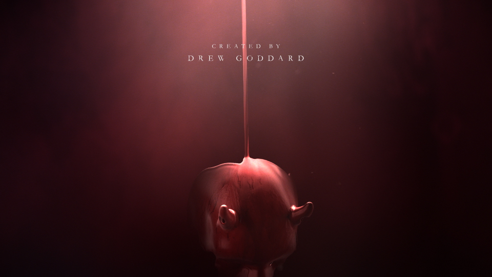
“I mean, I try not to think to literally about it. We were thinking about the insidious corruption that’s creeping into the city in the wake of The Avengers, as the reconstruction efforts start off. And thinking about sort of the toxic poison that blinds Daredevil in his youth was a large part of the inspiration to go towards liquid and gooey. I wouldn’t say it’s literally blood, but the bloody resonance of the red is definitely at the heart of what we thought made the idea powerful.”
One theory we like is that it’s actually chocolate…
“I like that! I’m going to say that from now on!”
The Gutsy Option
Whether you believe it’s blood or not, the colour is undoubtedly a bold statement, especially as it’s the first thing you see in this new part of the Marvel universe.
“We were just very happy the team was behind it. We presented them with a number of ideas, which is not something we always do – we hadn’t had a chance to talk to the showrunner before we went in for a presentation, so we came in with a couple of different things and they just seemed to really respond. We felt lucky to be working with a client that would pick the gutsy option, so to speak. From there, they were very supportive in helping to figure out how to make a full sequence in this kind of look and feel.”
Unused Ideas
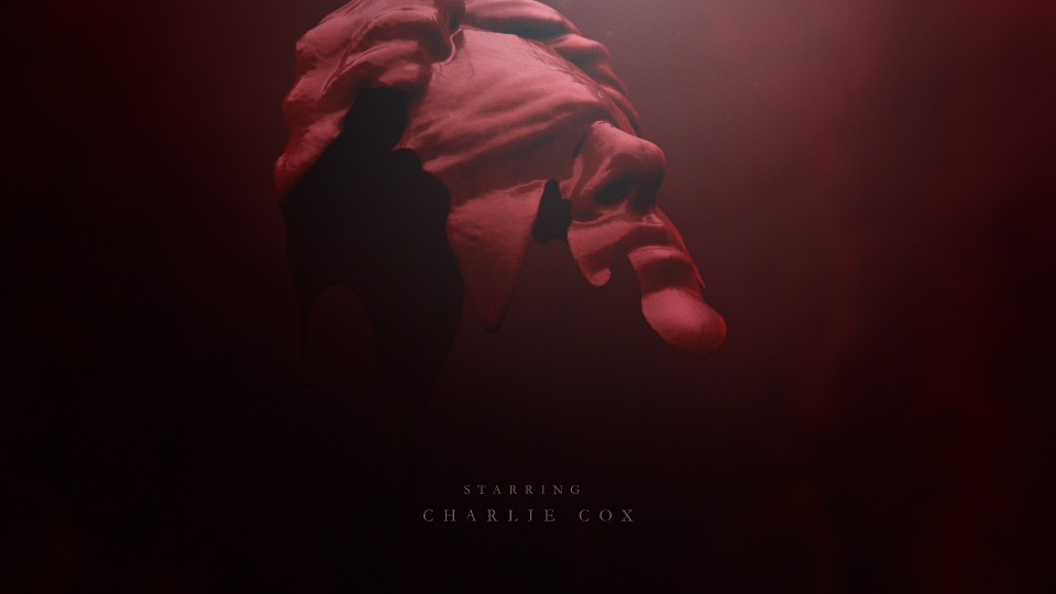
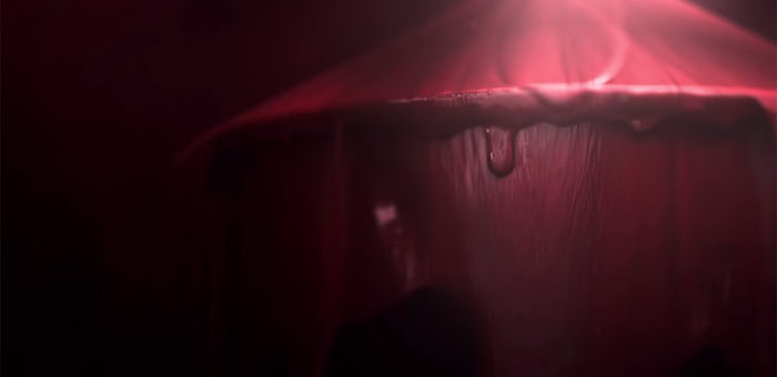
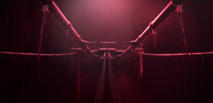
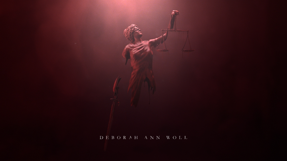
“We went to them with a number of ideas, one which was really based around the human form and statues and all the things you see in the final sequence, but didn’t deal quite so much with Hell’s Kitchen. We had this idea that was very much about how Daredevil would experience the world through sound, that was all about the details of Hell’s Kitchen. And they asked us to find a way to bring the two together, so that’s how we were able to get the water tower and some of the really cool imagery in there. It was not just about Daredevil, but about the place and what’s happening in the neighbourhood of the city that he’s protecting.”
Keeping It Simple
The typography feels like part of that tone too. Was there ever a temptation to include braille in some way, a la the the 2003 film?
“We very much focused on the dripping statue imagery, so we felt the simplest possible approach to the typography was the way to go. We enjoyed getting a nice simple serif font and slicing into it and knocking chunks out to make it edgy and contemporary. But we didn’t want to do anything more complicated. We didn’t want to overwhelm the composition behind it.”
Reading the Scripts
“We read at least one script (under extreme security protocols) before we developed ideas for it and I’m sure we’d seen a bit of material too, but we didn’t interact directly with the showrunners until the presentation. From there on out, they were very involved.”
Marvel’s Contribution
“I was impressed by the guys on the show and the people at Marvel: the way they engaged with the material was really smart and sophisticated and really targeted. They could be really clear with us as to what they wanted and they came up with lots of ideas that contributed to the process early on. And similarly were really collaborative and listened to us when we wanted things. It just reiterated in my mind that great sequences don’t come from great designers but great sequences come from great clients. That’s certainly something I’ve experienced, you know, from the jobs in my reel that I’m most proud of – the success has really hinged on having showrunners and executives that have good taste.
“A lot of the New York imagery came directly from those guys. Steve DeKnight and his team contributed a lot of ideas. You know, often it’s on these big conference calls where everyone’s throwing ideas, so I don’t want to incorrectly attribute something to someone! But things like the water towers, the skyscrapers, churches… It all came out of discussions about what sort of symbolism was going to be showing up in the show itself. [Joe] Quesada from Marvel was incredibly impressive to interact with. Full of ideas, very hands on: he’ll put out a pen and start doing sketches and send them round. A lot of ideas came out of discussions with him and getting material from him. I thought that was so cool. And it kind of made sense that Marvel has become such a big empire, if they’ve got people right at the top of it who understand comics and the creative foundations of the stories they’re telling and really see it from the point of passion and not commercialisation.”
Holding Daredevil Back
“He was always the big reveal at the end. What was cool about the way the show approached it was that they didn’t want us to copy the costume, so it didn’t become a literal depiction of the character straight out of the script, but more a sort of impressionistic, church statue version that our designer had done, sight unseen. It’s a little more symbolic.
“I think that makes the title sequence feel really whole and feel like its speaking more to the themes of the story and the motivations of the character, rather than just the nuts and bolts of the design.”
Picking the Right Music
“That’s part of the first conversation. But just because of the way production works, it’s always the last thing done – and often with very little involvement from us. It’s happened to me many times where we’ll work to a temp piece of music and they slip in a final piece and it can be a real let-down, that the music you created the piece to would have served it so much better. But it was interesting in this case, because we used one of my favourite tracks from when I was a kid to be the soundtrack we built the sequence to. We always knew it was a possibility that the show would buy the rights to it but because it’s a piece that’s been used in a lot of things, and I think it’s a bit over-exposed, the show decided not to.
“But this is where I come back to the point about the good taste of the guys on the show because they [John Paesano and Braden Kimball] composed that piece of music from scratch after we finished the titles and I love it. I think it’s fantastic. It serves it perfectly. It’s such a great tone. And I think I actually like it more than the temp music, which has never really happened before!
“I think that’s the sign of a truly great piece of score, if it serves the picture so well that it seems like it’s part of it. And that’s how I feel about it now.”
For more on Daredevil, read our interview with Charlie Cox.
Interview: Creative Director Patrick Clair
How does the title sequence process usually work? Do they invite you to pitch?
“Usually, there’s three to five different companies that would be involved in a pitch. We don’t always know who else is pitching. But yeah, certainly an invitation process. It’s quite involved for the show, as well as for us: you put a lot of man hours into it, but for them, hearing the presentations and then working through a detailed pitch and which way they want to go takes a lot of time, usually at a pretty critical juncture in the production, when they’re under a lot of pressure.”
“It’s kind of getting portraits of the characters and breaking them apart in some way…”
Elastic has something of a reputation now for its work…
“Yeah, absolutely. Elastic’s part of a trio of companies [along with in-studio partners VFX company a52 and editing company Rock Paper Scissors] that have been around for a long time. Angus Wall [designer of Seven, Fight Club and Game of Thrones’ opening titles] and his wife, Linda Carlson [Exec Producer of the Oscars 2015 titles], have been running them in Los Angeles for 25 years or more now. They retrospectively built those reputations around Hollywood and the entertainment industry, especially with long-time collaborations with characters like David Fincher, which have established a really trustworthy brand that people feel they can come to.
“And when you know Angus has already twice taken home the Opening Titles Emmy for Carnivale and Game of Thrones, it gives the impression to the big networks and especially the most creative networks, like HBO and AMC, that we’re a place to come to be trusted. As a younger director coming up, that’s what so exciting having representation like Elastic. When Elastic says to HBO you can trust this guy to do True Detective, HBO believe them. And that’s what’s opened the door for me to come in and do my own sequences like True Detective, Halt and Catch Fire and Daredevil.”
Halt and Catch Fire’s titles are great: not at all what you expect from a period, computer-based drama
“[Laughs] Yeah, digital sperm and collapsing portraits! That was lot of fun to do! I made that with my team back in Australia when I was there and it was heaps of fun. We did it just after True Detective, before True Detective came out, and it was such a kind of amazing, refreshing difference after the bleak Deep South to dive into this retro gaming hell! It was cool.”
Are you working on True Detective Season 2’s opening titles?
“The security around True Detective 2 is formidable to say the least. I think that’s all HBO would let me say on that.”
Given Louisiana was such a big part of the True Detective sequence – and the show overall – the new location of California would presumably offer some interesting opportunities!
“Absolutely and, you know, I’m very excited at the prospect of seeing what Nic and his team decide to do with such an evocative location for Season 2. I mean, as someone who’s recently relocated to Southern California, I know it’s a fascinating and inspiring place and certainly full of complexity. So I only imagine that the story he’s building will be beautiful and compelling.”
Update: Patrick Clair did direct True Detective Season 2’s opening titles. Here they are:
There seems to be a growing mainstream awareness, or appreciation of, the work that goes into title sequence these days. Would you agree with that?
“It’s always hard for me to judge because I’ve had my head in titles for 25 years, but I think there is some truth to that. I think that as people watch media in so many different places, having titles are something that sort of signposts a show and gives people a chance to sort of slip into the experience of watching the show or even a film. It becomes an important part of the experience. When you have so many people watching it across different platforms and on catch-up and on DVD, you don’t have all that network branding and promos to structure that viewing experience, but I think that experience of seeing a title sequence does give people a moment of calm and allow them to recalibrate themselves and get excited about the characters and the story they’re coming back to or about to see.
“I don’t think big and long is always the best…”
“I think we are also getting very used to seeing everything shelled in graphics and design and media, just because we’re watching so many things through the Internet and I think in many ways, titles are an extension of that too.”
Do you find yourself keeping an eye out for opening titles when you watch a new show?
“I think so. You know, obviously, you’re always looking for what other people are doing – there are so many great designers in the industry and they do really interesting things! So often by the time I’ve watched a show, I will already have watched the titles online somewhere first. But I think we’re an important part of the experience and I hope we’re not redundant yet! It’s interesting to see different networks make different choices about what their format’s going to be, so to speak. You know, HBO will push out for the epic 90 seconds or even more, whereas a network like AMC, like Breaking Bad has a 15-second title sequence, it’s just as strong. Even HBO’s Silicon Valley clocks in at 11 seconds, I think, but it was an Emmy nominee last year and it’s one of my favourite sequences from the last couple of years. So there’s a great diversity in the format.
“Having titles are something that sort of signposts a show…”
“I don’t think big and long is always the best but it’s certainly been great working with Netflix, where they do give you that full 60 seconds to let things breathe. That can be a lot of fun to work with.”
Do you have any favourite title sequences?
“I’ve got a couple, which I always mention. It’s really Dexter, Six Feet Under and True Blood. They all came out of Digital Kitchen, sort of mid last decade and they’re the most amazing set of titles! They’re so simple in their concept and so stunning in their execution and they perfectly set up the shows that they head. They’re an inspiration to me every time.”
Have you seen the 80s remake of the Daredevil titles in the style of Night Court?
“I’m going to watch it right now!”
(Watches it. Laughs.)
“That’s great. We should’ve done this!”
It’s amazing how much titles have changed since then.
“I think this is the challenge we face every time we try to figure out a new brief. A television show is about its characters, so you kind of want to show the characters or something that speaks directly to them. But two decades of title sequences like this make all of us and the showrunners terrified of ever putting the characters on-screen!
“It’s kind of getting portraits of the characters and breaking them apart in some way, like we did with True Detective, like we did with Halt and Catch Fire and – in many ways – like we did with Daredevil. It’s kind of at the heart of what we do. Because you can’t just put up an unvarnished image of an actor and not expect it to feel cheesy and on the nose. It’s got to be done in a much more interesting and subtle way.’
Did you see Too Many Cooks last year? It’s a great spoof on that cheesy style.
“I did! It’s epic. It goes forever! It’s crazy. Pushes it to the nth degree. It’s very amusing, but relentless. I did have to watch it in chunks, to be honest!”
Are you in talks with Netflix about working on their other Defenders series?
“All I will say is that Marvel keeps the details of their productions highly secure…”
Given that the location of Hell’s Kitchen is such a strong part of portraying Daredevil’s character visually, it would give the shows a nice consistency…
“I’m just going to run with no comment on that! I’m waiting on the Marvel security team to sweep into my office!”
Daredevil: Full Title Sequence Credits
Creative Director
Patrick Clair
Designers
Paul Kim
Kevin Heo
Henry Deleon
Concept Illustration
Yi-Jen Liu
Producer
Carol Salek
Assistant Producer
Kyle McIntyre
Executive Producer
Jennifer Sofio Hall
CG Lead
Andrew Romatz
Compositing Lead
Shahana Khan
Fluids Lead
Miguel A. Salek
3D Artists
Vivian Su
Katie Yoon
Erin Clarke
Kirk Shintani
Jose Limon
Jon Balcome
2D VFX Artist
David Do


