YouTube web player gets sleek new look
VOD News | On 05, Aug 2015
If you’ve been on YouTube this week, you’ll have noticed something different about it. Is it YouTube’s hair? Has it lost weight? All of those and more, because YouTube has got a new look – and it’s totally pulling it off
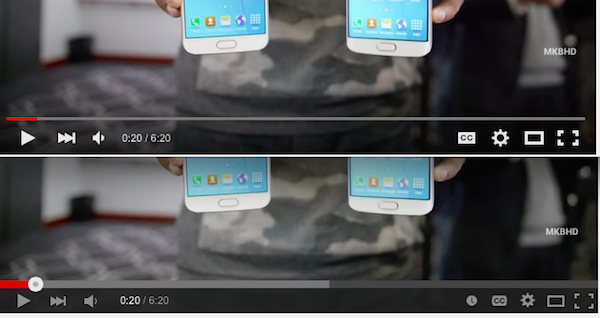
The revamped HTML5 video player takes all the essentials from the old one – the play button, for example – but gives them a sleek new finish. Gone is the black bar at the bottom. In its place? A transparent bar that disappears entirely when not being used, not unlike Apple’s latest version of Quicktime.
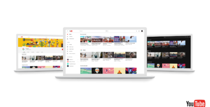
In other words, it’s a lot like the mobile app. The Google-owned company recently revealed at VidCon that mobile viewing is a huge part of the video site’s growth, with watch time on mobile devices more than double that of a year ago, with the average session lasting over 40 minutes. In response, the mobile app has been given an overhaul – including a way to watch vertical videos in full-screen – so it’s only natural that the web version should follow suit.
Ooh la la! Our new player design is slicker than a squirrel on waterskis! pic.twitter.com/9tS1pm3NiG
— YouTube (@YouTube) August 3, 2015
Cross-device continuity is a big thing for VOD services, as they strive to make the viewing experience as seamless as possible as people move from computer streaming to watching on the go. Netflix, for example, has now updated its computer and TV app interfaces in line with its revamped mobile apps.
Hat tip to GoogleSystem.blogspot.co.uk for the handy screencap.


