Introducing the new look Netflix: What’s changed?
VOD News | On 16, Jun 2015
Netflix is rolling out its new interface from today.
The redesign is the first major update to the site in four years – which, in Internet terms, is even older than it would be in dog years.
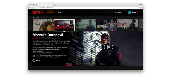
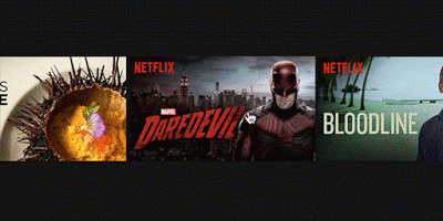
The interface has been built from the ground up with the aim of making discovering shows and films “faster and easier”. This has mostly been achieved by making the website more like an app than a series of linked web pages. That means no more carousels as we currently know them, with the old layout replaced by a tile-led format that will feel familiar to users of Netflix’s TV and mobile apps.
How people use Netflix has used a lot over the years, the company says on its official blog, as people spend more and more time using mobile and tablet apps.
Indeed, research last year found that Netflix was the most popular video app in the UK in Q3 2014, while a study from Juniper Research recently predicted that mobile video streaming will increase by nearly 8 times in the coming five years, by which point total mobile data traffic will account for the equivalent of 10 billion Blu-ray movies every year.
With browsers becoming more sophisticated at the same time, allowing for richer visuals and animations, the new Netflix is a “richer, more visual experience,” says the VOD giant, which will tie together the website across the different devices used to access it.
“We’ve designed the website to work whether you are using a mouse, trackpad, or a touch screen. Touch screen users can tap to play or open details, and swipe to scroll through rows of titles,” says Cameron Johnson, Director of Product Innovation at Netflix.
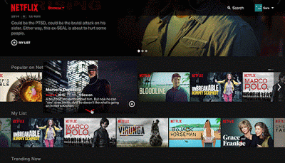
When browsing titles, information now appears slickly in-line and in context rather than on a separate page. When you hover your mouse over a title, you will see a slideshow of images from that movie or show.
“We hope this slideshow will give you a better feel for what the show is about than reading the description alone,” adds Johnson.
Clicking on the title or synopsis will then open an inline details pane, allowing you to browse episodes and read details and reviews – as well as the familiar links offering “more like this” and cast, genre and mood tags.
Even scrolling through rows has been tweaked slightly, with a mouse-click advancing a full row at a time.
The website is rolling out globally starting today, although it may take up to two weeks to appear on your computer. Some members on older versions of popular browsers will be prompted to upgrade their browser before they can access the new site.
Tags
Netflix
Related Posts
Amazon overtakes Netflix in 2016 Golden Globe nominees... December 10, 2015 | VOD News
Trailer: The Lincoln Lawyer returns for Season 4... January 17, 2026 | VOD News

Trailer: Netflix’s Over the Moon heads to cinemas this October... October 16, 2020 | VOD News

Paquita Salas returns to Netflix March 14, 2019 | VOD News