The new BBC Three logo is not a BBC Three logo
VOD News | On 04, Jan 2016
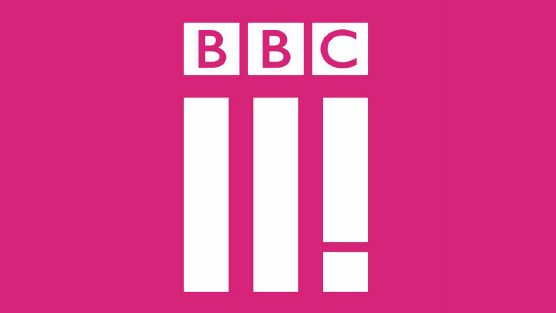
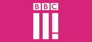
The new BBC Three logo has been unveiled. Its secret weapon? It’s not a BBC Three logo. (But it also is.)
The logo was unveiled on the web today, ahead of the channel’s leap from the TV to the web. The controversial move, which we’re excited about (and we’ve already written about why here), is partly a cost-cutting measure, as the broadcaster faces tougher financial times, but also a natural response to the growing number of younger viewers consuming video online.
The problem is that the new logo, in attempting to be different, has also opened itself up to a wave of online criticism. The BBC has attempted to pre-empt such things with a new blog post from Three’s Head of Marketing, but the broadcaster already managed that years ago with its own BBC-spoofing satire, W1A. And the logo really does look like something Siobhan Sharpe would have come up with.
Reaction on Twitter has been predictably vocal:
Anyone from @bbcthree listened to this album from 2012? pic.twitter.com/3XL9OdFHS7
— Sean Spooner (@spoonersean) January 4, 2016
The biggest problem? It doesn’t even say “BBC Three”. It says “BBC II!”, like an angry, excited or shouting cousin to the older channel. To be fair, that almost makes sense.
“Thanks to W1A we’re cursed at the BBC when it comes to marketing,” admits Nikki Carr, who acknowledges that the logo doesn’t say “BBC Three”.
The channel even jokingly refered to W1A in its announcement:
“It’s easy to belittle the importance a logo has in supporting a brand, and I’m sure the usual critics will have their say – “It looks like Adidas”, “it looks like a “hamburger menu icon,” “it doesn’t even say three”, “are they Roman numerals” – but If I’m being honest I’m not worried,” writes Nikki.
The thinking behind the logo, though, is actually quite logical: the new channel is founded on three principles.
“The first is ‘make me think’ – hard hitting documentaries like Suicide and Me and thought provoking drama like Murdered By My Boyfriend,” she explains. “The second is ‘Make me laugh’- distinctive comedy like People Just Do Nothing or new entertainment shows like Murder In Successville. The third, the exclamation mark, is ‘Give me a voice’, which is what we will do for young people.”
The move to do something different, meanwhile, is commendable, because that is exactly what BBC Three will be about: the channel will spend 20 per cent of its budget on different types of content that is not traditional TV, from short-form videos to animations and picture-led stories.
This will be delivered daily to audiences “via new products”. An app appears to be the first port of call, as Nikki adds: “The new icon works equally as well on a TV as it does on a smartphone or tablet. It works as an app icon and digital on screen graphic… We needed to develop something that worked on a TV screen and as an app icon.”
The old BBC Three logo, though, also displayed on a smartphone and a tablet. It would have worked as an app icon and already did work as a digital on-screen graphic. It even said “BBC Three”.
“Look at Snapchat,” continues Nikki. “They’re doing okay without having Snapchat in their logo.”
And there you have it. The new BBC Three logo. It doesn’t say BBC Three. But it also doesn’t say Snapchat. So that’s something.
What do you think of it?
