YouTube unveils redesign – including new dark mode
David Farnor | On 03, May 2017
YouTube is unveiling a new look for 2017, including a snazzy new dark mode.
The video site recently celebrated its 12th birthday and, while the streaming hub has been the subject of controversial debate in recent months, thanks to concerns about ads placed next to inappropriate and extremist content and the inadvertant censoring of LGBTQ videos by its , YouTube is still in the mood for celebrating. Its main way of doing so? By redesigning its whole layout.
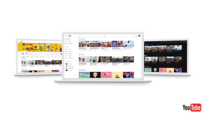
The new look for the desktop experience is designed to make YouTube “easier and more fun to use”, highlighting favourite videos, introducing infinite scrolling, a la Netflix, that will keep recommending videos, and larger navigational elements that are easier to click.
As of Monday, YouTube is opening up a preview of the new design to a small group of users. The company calls it “Material Design”, which is based upon simplicity, consistency (aligning its desktop look with its mobile app and Google platforms) and beauty.
Under the bonnet, the sleek interface is built on a new, faster framework named Polymer, which enables quicker feature development. One of those? Dark Theme. Developed to cut down on glare and let you “take in the true colors of the videos you watch”, Dark Theme turns your background dark throughout your entire YouTube experience.
If you want to try out YouTube’s latest look, you can opt-in to preview the new design at youtube.com/new – and Dark Mode is then available from a dropdown on the right hand of the screen. (You can return to the current design by selecting “Restore classic YouTube” from the Account Menu.)
Tags
YouTube
Related Posts
Nike unveils YouTube original series January 27, 2016 | David Farnor
Anthony Padilla steps away from Smosh June 15, 2017 | David Farnor

YouTube orders James Corden football series... October 2, 2017 | David Farnor
YouTube denies scrapping high-end scripted series as Origin gets axed... April 13, 2019 | David Farnor